How to choose a font for wedding invitations + 5 fonts tips
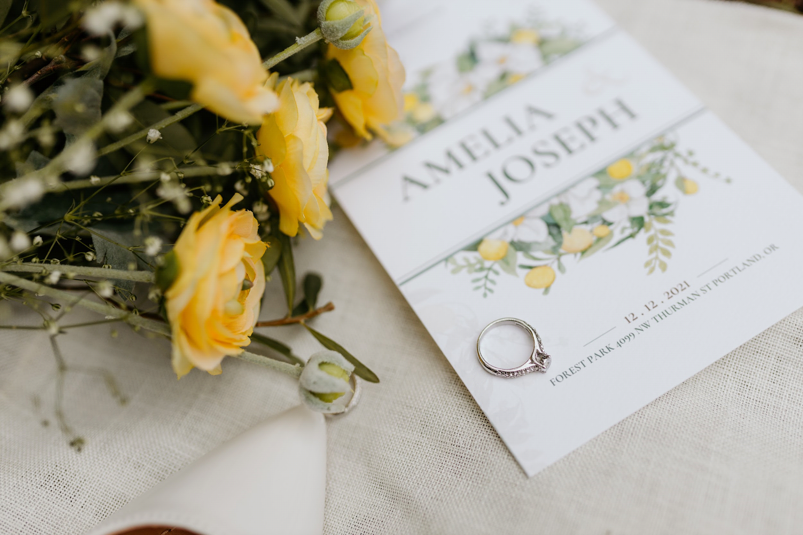
Whether or not you’re particular about fonts in your daily life, you’ll quickly realize how important they are when you’re planning your own wedding. Your chosen font can make or break your wedding aesthetic, given that weddings involve an inordinate amount of stationery, signages, and creative content. And that all starts with the design of your wedding invitations.
If you’re DIY-ing your wedding, here are 5 tips to keep in mind when choosing your wedding invite font:
1. Follow your wedding motif
Are you planning a bohemian-style beach wedding in Mexico, a formal church wedding in a 100-year-old cathedral, or a spring garden wedding in your childhood home? Each motif calls for a highly specific font. You will want to give your guests a preview of your ceremony with your invite, and the fonts you choose will make a big impact in that first preview.
2. Know your available font types
In general, there are four main font types you would normally associate with weddings. The first two, serif and sans serif, are what we typically use in our day-to-day life. What sets them apart is the stem at the ends of letters or serif. Sans serif, as the name suggests, does not have stems or serif – think Arial or Helvetica. The lack of stems give them a more casual and contemporary feel. Serif fonts have stems, making them more formal, like the most recognizable font, Times New Roman.
The other two, script and display fonts, are a little more decorative. Script fonts, like the name suggests, mimics handwriting or calligraphy. Display fonts are a bolder type of decorative font. Based on its name, it’s mainly for display and not to aid readability.
3. Find legible fonts
Aesthetics are important when choosing a wedding font, but so is readability. You want your guests to be able to read your wedding invite and get all the necessary information right. The key is to use simple and readable fonts for logistical information such as the date and time of the event, venue address, and RSVP details.
4. Limit your choice of fonts
A simple rule of thumb to follow in any design that involves typography – limit your fonts to 1 or at most, 2. This keeps your invitation attractive and distinctive but still readable. This is highly advisable especially if you’re using script or display fonts.
5. Go for consistency
To maintain the aesthetics you’ve carefully established in your wedding invite, make sure that the rest of your event more or less follows the look and feel you’ve set in your stationery. That means try to keep uniform fonts for signages, table settings, and other placements that will need written information. That means, when choosing your fonts, you need to think about how they will look used in different settings in your entire wedding.
15 Wedding Font Ideas to Use
When looking for wedding fonts, don’t just stick to your usual options. Websites like Creative Fabrica offer literally thousands of different creative fonts that will allow you to get totally creative with your wedding stationery. Below we’ve listed a few of our favorite wedding font options:
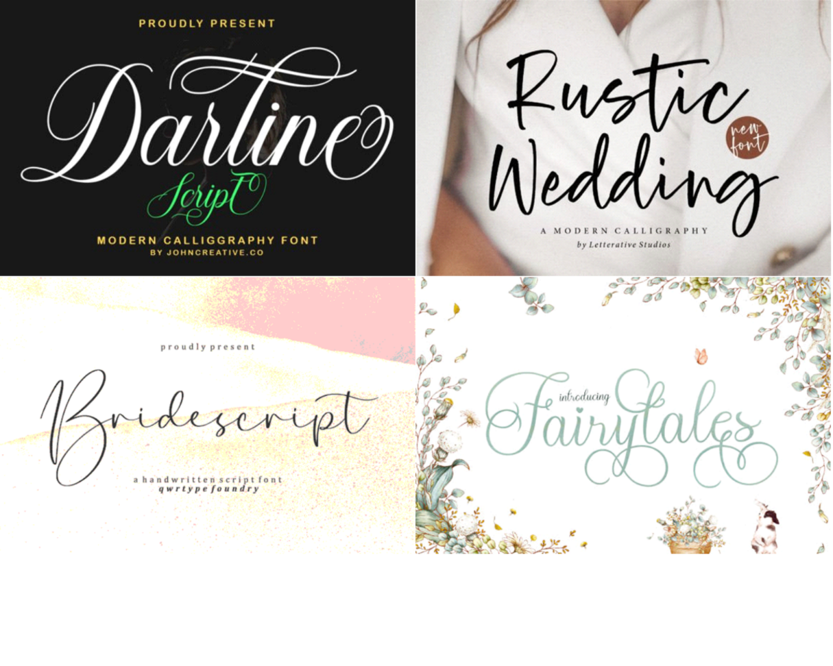
Bridescript font has both a contemporary but elegant feel, with its clean flourishes inspired by classic calligraphy. It’s a great font to use for minimalist beach weddings.
The Darline Script font is a sophisticated type of script font that’s versatile enough to use for formal and informal wedding motifs.
Informal and friendly, the Rustic Wedding Font, like its title, lends itself well to outdoor-type weddings with a DIY and rustic feel.
If you’re planning a whimsical fairytale-inspired wedding, this Fairy Tales font will add the perfect touch to your motif. Its alternate characters, along with the classic calligraphy characters, will supply the right amount of fascination to the typography.
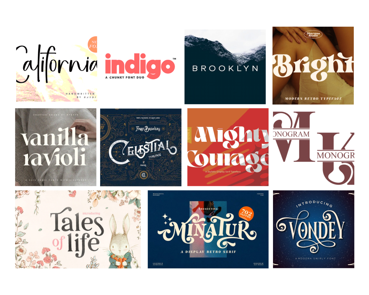
This modern calligraphy font will look good for beach destination weddings and boho-themed weddings as well, with its subtle style and casual flourishes.
Subtle yet bold, this font combo contains both the regular and outline versions of the font, allowing you to create more layers to your minimalist wedding invite.
This neat sans serif font will look great both as the main font or as in combination with more detailed fonts. Used on its own, the font will look best for contemporary city weddings.
This bold retro-style serif font is best for funky vintage-themed weddings – think 60s or 70s disco aesthetic. Tone down its outrageous style by pairing it with a neat sans serif font.
A great combination of elegant and contemporary, this font adds an ornate but still minimalist feel to any design.
Quaint yet fantastical, this font duo, featuring both serif and swirly characters, is the ideal choice for simple spring garden weddings.
This display font has a classy retro feel while still retaining a distinctly contemporary style in its minimal flourishes. It’s versatile enough to use for formal and informal settings.
This vintage-style display typeface adds a layer of mystery to your invite, with its bold lines and unexpected curves.
This display font is a striking insert to give your wedding invite that unabashed classic and traditional feel.
This swirly display font is a modern take on the distinct Hollywood Golden Age aesthetic, perfect for 40s or 50s style weddings.
A little offbeat while still classic, this bold display font would be a great choice for stylish couples who are not afraid to experiment.
Choosing your wedding font is a fun creative exercise that could help you truly visualize what you want your big day to look like. So, browse your options carefully before deciding on the “one”.
If you’re on a tight budget, Creative Fabrica regularly features free fonts for download where you can find similarly themed fonts for your wedding. Be sure to download the ones you like as soon as you see them as these are on a limited-time offer.
Free Wedding
Giveaways + Sweepstakes
Enter sweepstakes & giveaways and enter to win a free honeymoon when you join. New winners are announced every week!